top of page

Two Brunettes
As eCommerce Manager for Two Brunettes, a women's boutique with two stores and an online presence, I focused on driving sales, maintaining functionality of the website, and fulfilling online orders. In each aspect of my job, I worked to make a better customer/user experience.
*NOTE: Company logo designed by unknown designer.
Web Management & Marketing
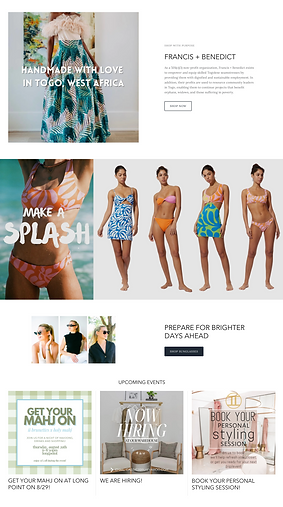
Homepage Re-design
GOAL: Increase sales through a more robust website - with more visuals and inspiration - while keeping imagery and appearance on brand/cohesive and decreasing paint points for customers.
TOOLS: Shopify, Canva
.png)


Automated free shipping offer - no longer requiring customer to input coupon code. Offer visible on all pages to promote increased spending and reducing customer frustrations when code is overlooked.
-
Added featured product tab to promote one of store's most favored brands .
-
Removed repetitive quick links (placed in footer)
Added teaser to website so that customer always has the option to sign up for newsletter and save
Hero image + coordinating collection.
Previous version had hero image with static New Arrivals Collection.
Added an additional featured collection and featured product, in this case a popular item, recently restocked.
Shop by past collections
Added instagram feed carousel, to inspire customers by offering real life looks at products. Instagram was a big source of sales for the website, so I felt it was important to promote lifestyle images to all visitors.
Original homepage body
Original homepage header
Original Footer
-
Cleaned up footer by updated color ways and removing unnecessary/unprofessional placeholder images.
-
Added directions to both store locations (original only gave directions to one).
-
Moved and enlarged "Quick Links" (previously found minimized, under payment methods), so customers would be able to find information about returns, etc. in a quicker fashion


Navigation Update
Original
ISSUE: Often difficult for customers to locate products on the website. Additionally, it was challenging to find products for linking purposes on social media.
SOLUTION: Add hierarchy to categories. Add additional subcategories to minimize return for each. This also involved re-tagging/categorizing every in-stock product, as well as learning to make CSS updates so that the navigation would display correctly.
Updated


ISSUE: No way for customers to input recipient information, so the majority of gift cards were going unused. Some would add a note in the "notes" box at checkout, assuming we would automatically send it to the intended recipient, even without supplying an email address. Most purchasers were unaware that their recipient had not received gift card.
SOLUTION: Found/installed an app (with a $0 budget) to accommodate gift options. Additionally I created a new gift card graphic that was more on brand.
Gift Card Update
Original
Updated


Product Page Edits
Original
Updated
ISSUE: Shopify theme did not offer way for customers to sort by style/type of denim, one of the business' best selling products
SOLUTION: Created new collections of denim, based on style, allowing customers to view only what they are interested in


ISSUE: Customers unaware that product might come in various color ways.
SOLUTION: Added swatches beneath products with multiple color ways. This way, customers wouldn't overlook a product based on color.

ISSUE:Lacking detailed production information. Not cohesive from product to product.
SOLUTION: Established product description guidelines, to be filled out for each item on the site. This helps customers know if a product will work for them and also help with SEO.
ISSUE: Customers unaware that sale items are final sale. Often mailing back for return (at their expensie).
SOLUTION: Coded "FINAL SALE" above all sale products


Point of Sale with Allocation Feature
ISSUE: Website doesn't share product locations and allocates all products to one store. With two stores, customers are often frustrated that they don't know which store an item is located in. Unfortunately, the company's point of sale was not sharing location information with the Shopify store.
SOLUTION (in progress): Worked with bridge company to build a feature that would allocate products to both stores and allow the POS and Shopify to communicate, reducing customer (and employee) frustrations.


Return FAQs Update
ISSUE: Customers don't like to read! Were always unaware of our return policy.
SOLUTION: Highlighted most important information regarding returns. Added sections/graphics to help lead the eye to information pertaining to the customer.
SOLUTION: Added self-serf returns to online accounts, so that customers could request returns through the website, without having to email customer service for approval. Guidelines in place prevent customers from requesting returns for final sale merchandise or if return deadline has passed.

Thank You Card
Literature included in all online orders.
The goal of this postcard was to thank the customer for their purchase in a friendly and familiar tone. offering appreciation and acknowledgement from a small business.
ISSUE: Customers were ignoring this card and the information provided, constantly emailing asking how to make returns. As Head of Fulfillment, I wanted to communicate more clearly and authentically with customers, in a more professional manner.
TOOLS: Canva
FRONT
FRONT CHANGES:
-
Contrast for more hierarchy
-
Concise text
-
More white space to lead the eye
-
Adjusted background color to match website, offering a more cohesive branding experience, as well as differentiating between the front and back of card
BACK
BACK CHANGES:
-
Contrast
-
Hierarchy
-
More white space to lead the eye
-
Highlighting vital information to make it stand out
-
Greater explanation as to how refunds are processed/store credit works
-
Acquired new domain registered email address for customer service inquiries, in an effort to appear more legitimate
Marketing Emails
Concept and creation (text, visuals, template) of weekly marketing emails created in an effort to boost online sales.
TOOLS: Canva, Klaviyo


bottom of page